
ADVERTISING AND DESIGN
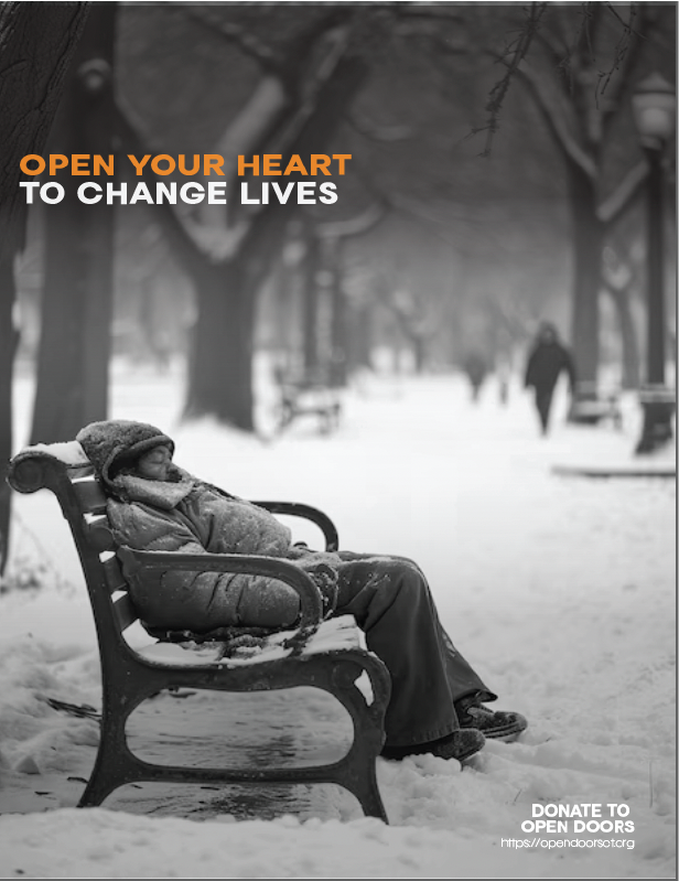
OPEN DOORS AD CAMPAIGN
For the Open Doors homeless shelter ad campaign, I wanted to create something that would immediately grab attention and convey the gravity of the issue. I decided to use a black and white color scheme because it adds a sense of drama and urgency—without the distraction of color, the message becomes more raw and impactful. The contrast between the dark and light tones emphasizes the stark realities faced by those without shelter, while also bringing focus to the key elements of the campaign. Typography was a critical part of this design. I chose bold, strong fonts to create a sense of urgency and authority, ensuring that the words really stood out against the simplicity of the black and white backdrop.

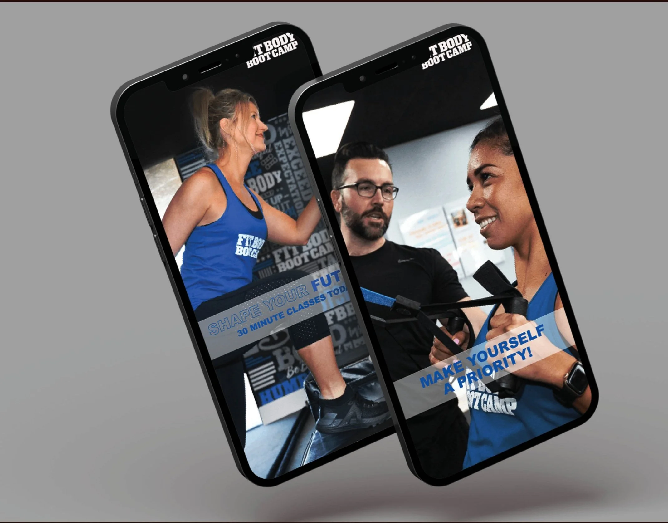
FIT BODY BOOT CAMP MULTI CHANNEL CAMPAIGN
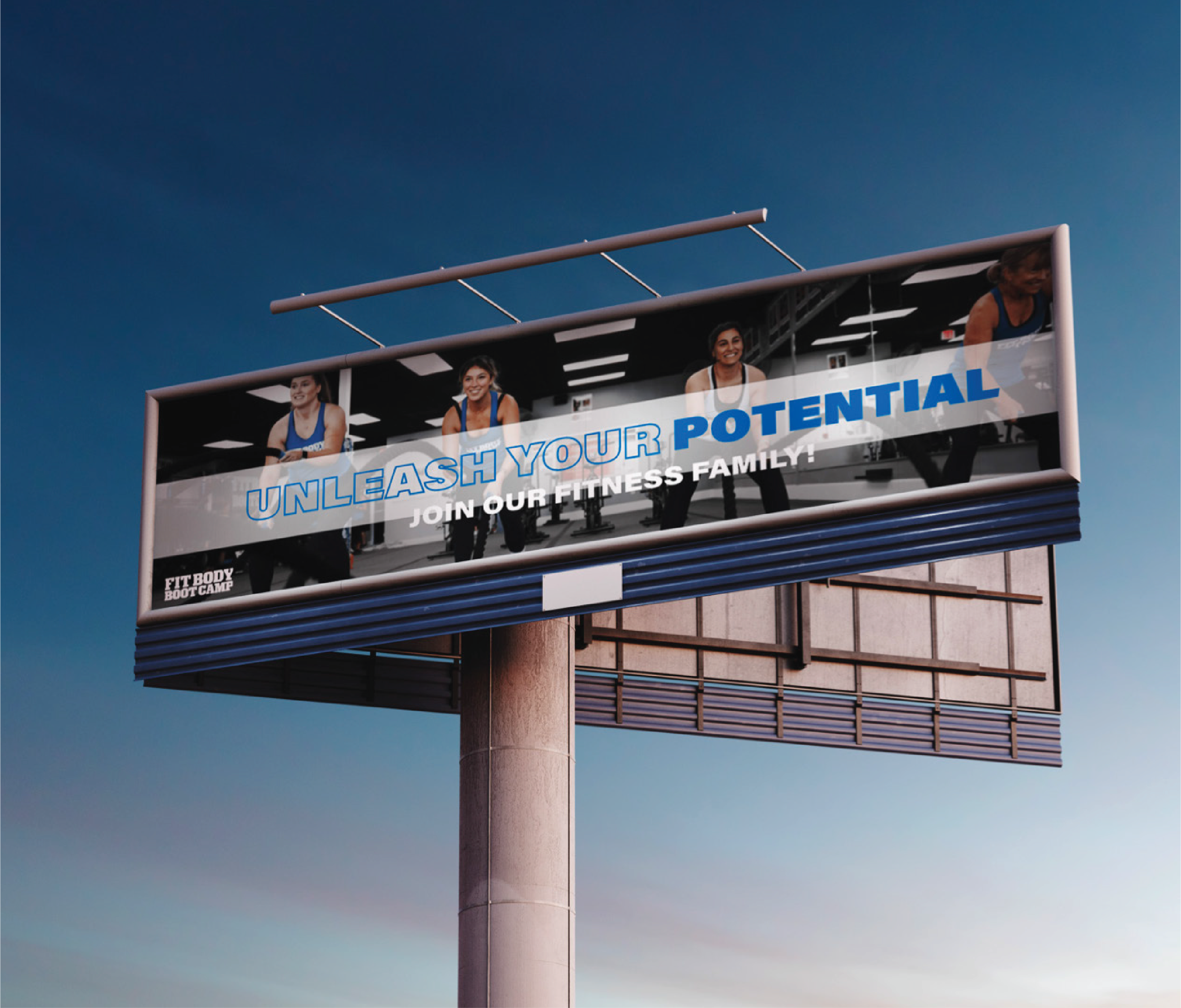
For the gym billboard ad, I wanted to create something that immediately stands out and grabs attention, reflecting the bold, energetic vibe of the gym. I opted for large, impactful typography that commands the viewer's eye, with strong, angular fonts that convey strength and determination. The words are simple but powerful —something like "UNLEASH YOUR STRENGTH" —designed to inspire action and push people to challenge themselves.
BILLBOARD

For the gym banner ad, I wanted to make sure it was bold and impossible to ignore. I focused on using powerful, high-impact messaging like “STEP OUT OF YOUR COMFORT ZONE” or “BELIEVE IN YOURSELF” ensuring the text is large and attention-grabbing. The typography is strong and modern, with sharp, angular fonts that communicate strength and resilience.
BANNER ADS
SPOTIFY

