BRANDING AND PACKAGE DESIGN
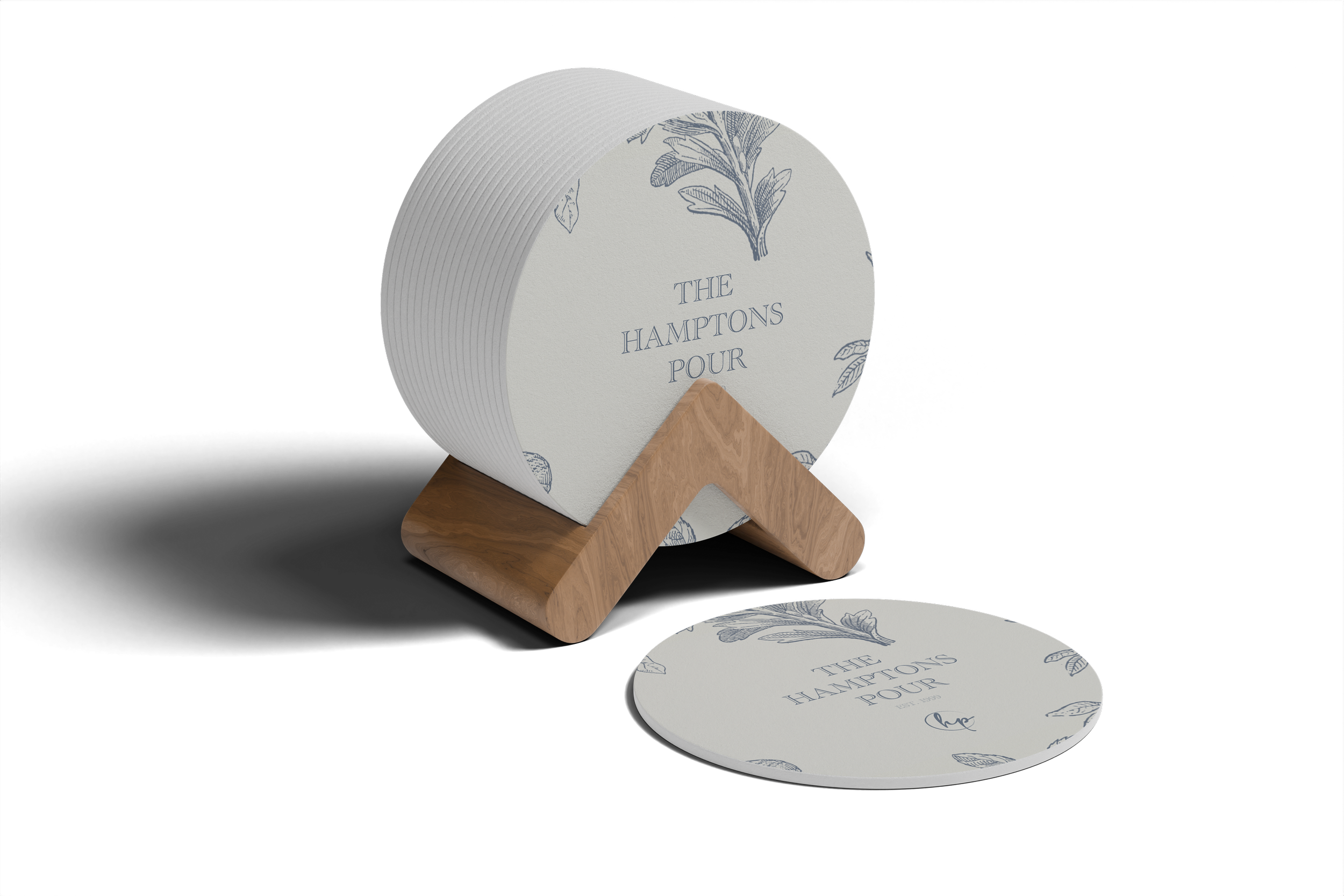
THE HAMPTONS POUR
Wine Brand
For The Hamptons Pour, I wanted the design to capture the essence of coastal luxury and the refreshing, laid-back elegance that defines the Hamptons lifestyle. To convey this, I decided to use a flowery design intertwined with soft blue tones to represent the ocean’s calming yet vibrant influence.
The floral elements were carefully chosen to bring a sense of sophistication and natural beauty, incorporating delicate, almost ethereal flowers that evoke the blossoming landscapes of the Hamptons.

-
![]()
Wine Bottle
-
![]()
ToteBag
-
![]()
Wine Bag
-
![]()
Wine Box
-
![]()
Coasters


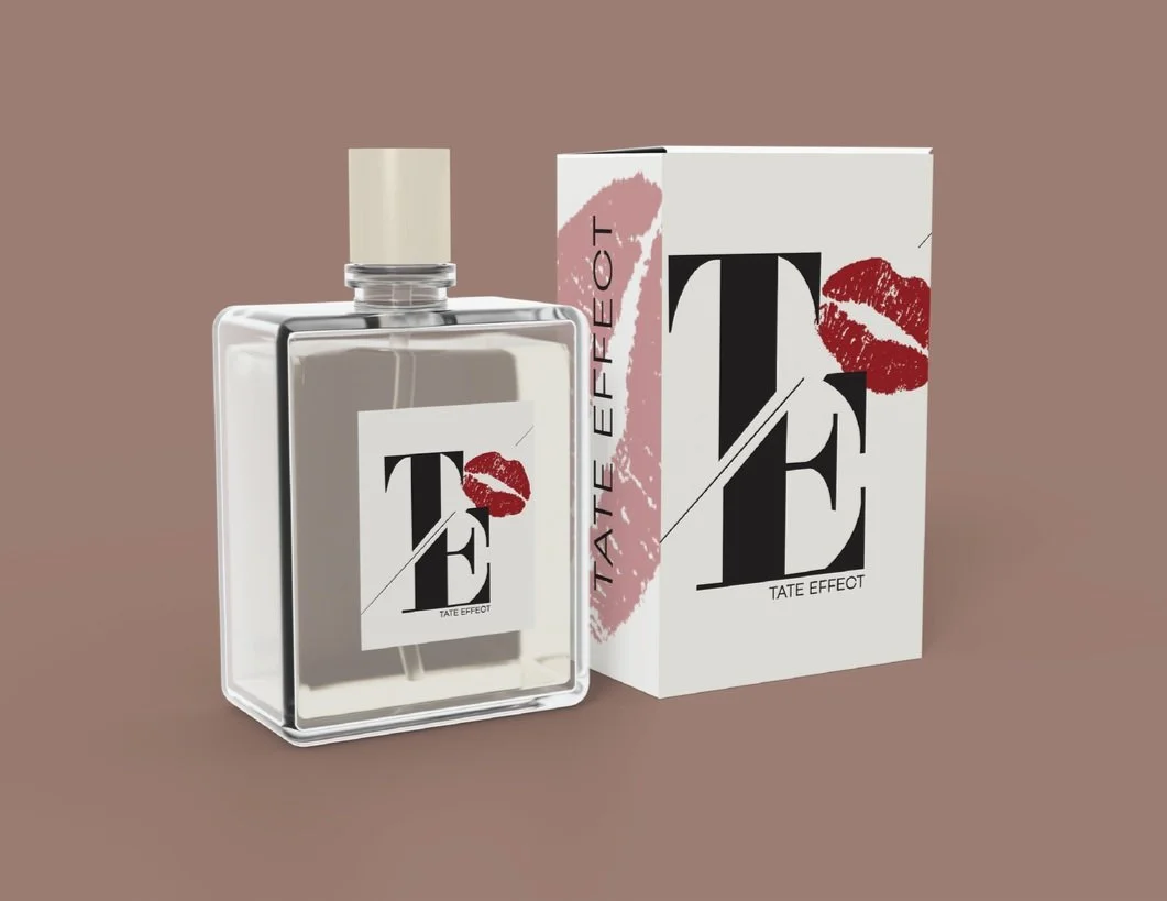
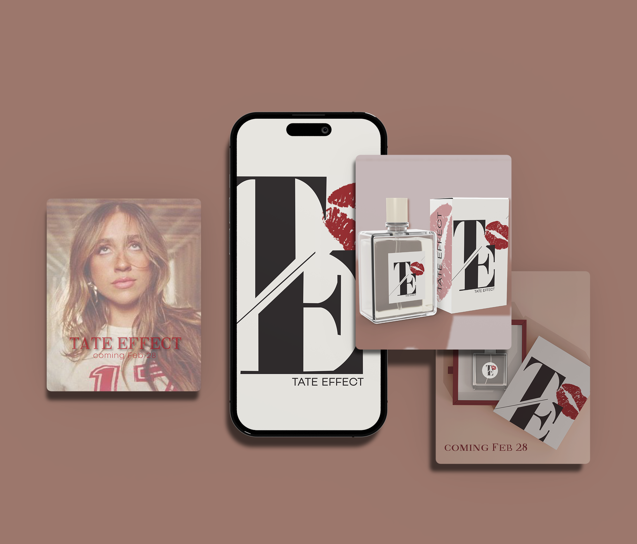
TATE EFFECT
The Tate Effect is as much a visual experience as it is a sensory one. The design of the bottles embodies the essence of Tate McRae—bold, striking, and undeniably unique. The rich, creamy base symbolizes purity and depth, while the vibrant red accents inject a fiery, passionate energy, capturing Tate's boldness and the raw emotion at the core of her music. The deep black elements add a layer of mystery and sophistication, reflecting Tate’s edgy yet thoughtful persona.
Each bottle feels like a statement piece, designed not just to sit on your vanity but to command attention. The sharp lines and sleek curves mirror Tate's modern style, effortlessly blending elegance with attitude. The combination of cream, red, and black is an intentional reflection of her artistic journey—soft yet fierce, delicate yet powerful, with layers of complexity that invite you to look closer. It’s a fragrance line that doesn’t shy away from making a statement, just like Tate herself, offering a bold visual aesthetic to match the depth and impact of the scents inside.
Perfume

-
![]()
Perfume Box
-
![]()
Perfume Box
-
![]()
Print Ad
-
![]()
Social Media Ads